


How to Make Great Charts
An entirely biased view

Edward Tufte—the godfather of data visualization (charts!) wrote, “graphical excellence is the well-designed presentation of interesting data—a matter of substance, of statistics, and of design.” Here are some of my deeply biased opinions—5 of them—on what makes a great chart. If you’d like some help achieving graphical excellence with your data, simply reply to this email.

In my former life I was a bond market strategist. There are many different kinds of bonds. They range from the safe and staid bonds issued by the US Treasury, to the highly risky ones issued by questionable enterprises in “emerging market” countries.
The eccentricity of the professionals in the bond market is proportional to the riskiness of the bonds they work with. For example, when I worked in London covering “high grade” bonds issued by multinational European companies, my clients were mostly serious Swiss and German types. Then I moved to New York to cover Latin American markets—riskier bonds with juicier yields—and my clients and colleagues were more colorful characters to match.
1. Put the ‘Art’ in ‘Chart’
One of my emerging-market colleagues was a lovably goofy Italian expat named Donato. Donato sat next to me on the trading floor. One quiet morning he spun around in his chair—he must have been reading my research—and exclaimed loudly in his thickly-accented English, “Ah, Aziz, you put the ‘Art’ in ‘Chart’!”
I didn’t fully appreciate Donato’s wisdom until years later, when I worked as a graphics reporter at the Wall Street Journal. That’s where I finally, thoroughly internalized the idea that charts are both an efficient way of conveying numerical information and a way of grabbing the eye—a form of art.
Here’s the challenge: the two are in tension.
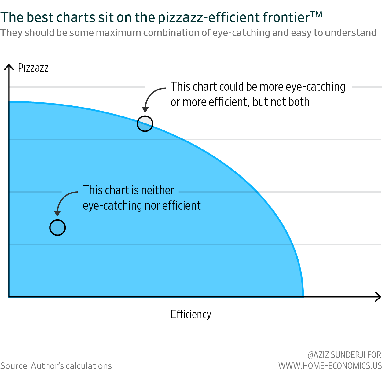
The chart types we are most familiar with—line charts, bar charts, and scatter plots—are efficient: we know ‘how they work’, and we can read them quickly. But they’re also visual clichés: we are so familiar with these chart types that we often subconsciously ignore them entirely. On the other hand, visually-stunning charts grab our attention but are often harder to decode.
There is no solution, only a way of optimally navigating this tension: charts should be as efficient as possible for any level of pizzazz (the technical term). The best charts sit on the pizzazz-efficient frontier, not within it.

Still with me? Here are 4 more of my unsolicited opinions about charts…
2. Charts are hard work for readers. Use them sparingly.
Just as your laptop has a limited amount of working memory, so does your brain. North American phone numbers are 7-digits long because research has shown that most people have working memories that extend no further than that (Miller’s Law).
Processing and internalizing new information—including graphical information—uses up some of this working memory. If you groan slightly when you come across a chart, that’s because your brain flinches at this cognitive tax: What are the axes? What do the series represent? What relationship is being illustrated? Even chart maniacs like me feel a subtle split-second panic when we come across a chart and we’re forced to make a decision: is this chart worth my time?
You should only use a chart if the benefits justify the cognitive load. Perhaps the relationship is sufficiently complex to justify a visual representation. Maybe the point you’re making is contentious, and displaying the data is necessary to address reader skepticism. But prose is often a sufficient—and a more efficient—way of getting your point across.
3. Make it easy: titles, labelling and annotations
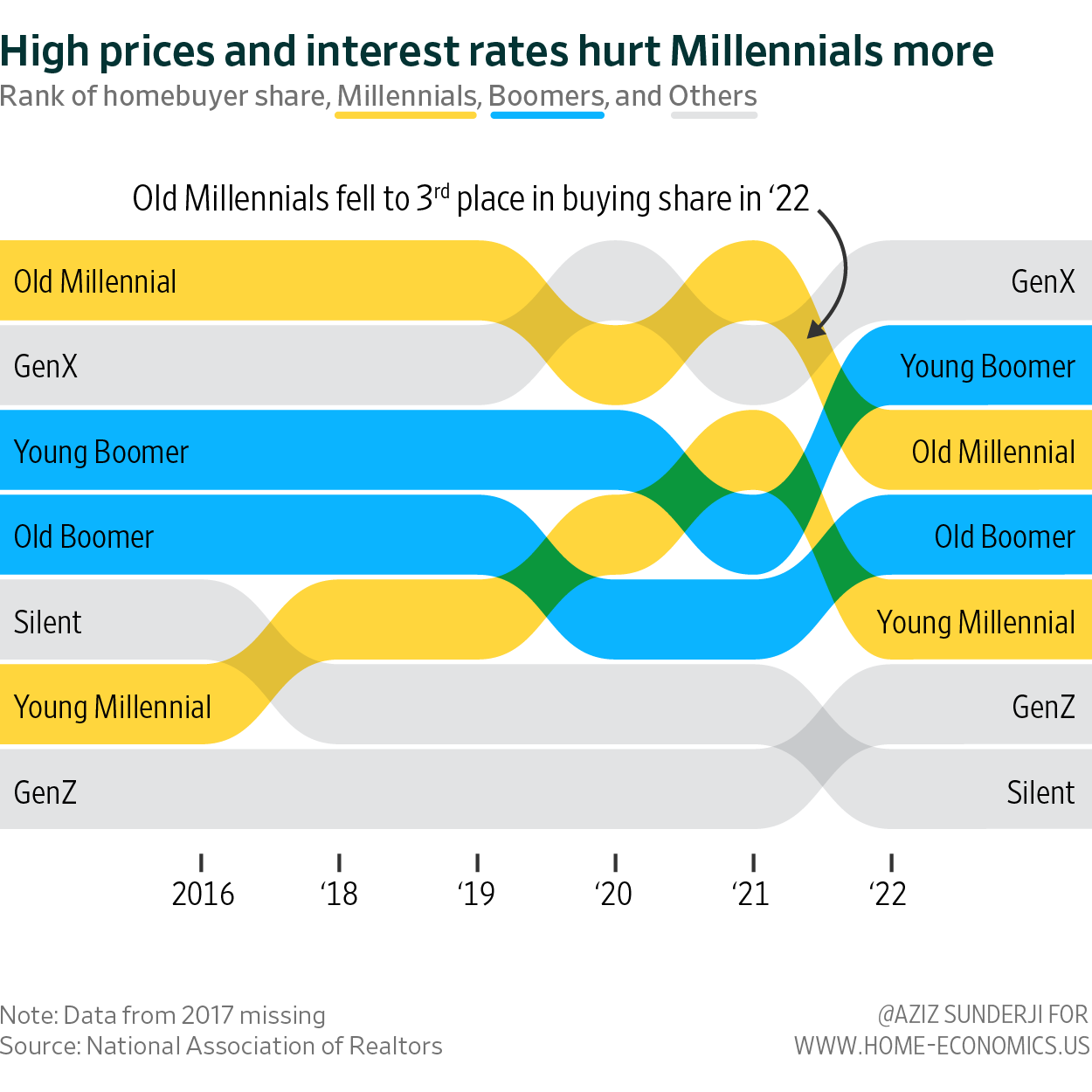
Especially when using unconventional chart types—like this bump chart (below) I used in an article for the Financial Times—there are three things you can do to lower the cognitive burden on your reader.
Use the chart title to tell the reader the point the chart is making. Make sure you use a font that’s bold and large enough to ensure that’s where the reader starts (the title should be the boss in the visual hierarchy). Use a subtitle to describe the data. I’m sometimes tempted to make a pun (the Economist is masterful at this), but coming up with a good pun is time consuming and usually not actually very helpful for your readers.
Add annotations. These should be used sparingly, but can achieve two things. First, a good annotation guides your reader to what the chart shows—it clarifies what each series refers to (and can replace a label or legend in this way). Second, it tells them the insight they should take away from the chart.
Lose the legend. They’re a pain in the ass for the reader. Legends are the data viz analogue of “the former” / “the latter” sentence structures. Consider this annoying blurb: “We were offered tea and coffee. I chose the former, Chris the latter.” Notice how when you encounter “the former”, you have to return to the prior sentence to see what “the former” refers to. As Eugene Wei writes:
“the problem with a legend is that it asks the user to bounce their eyes back and forth from the graph to the legend, over and over, trying to hold what is usually some color coding system in their short-term memory.
Here is an egregious example (from an otherwise great analyst). It’s made worse by the minimal surface area of the lines, which makes discerning their color very difficult:
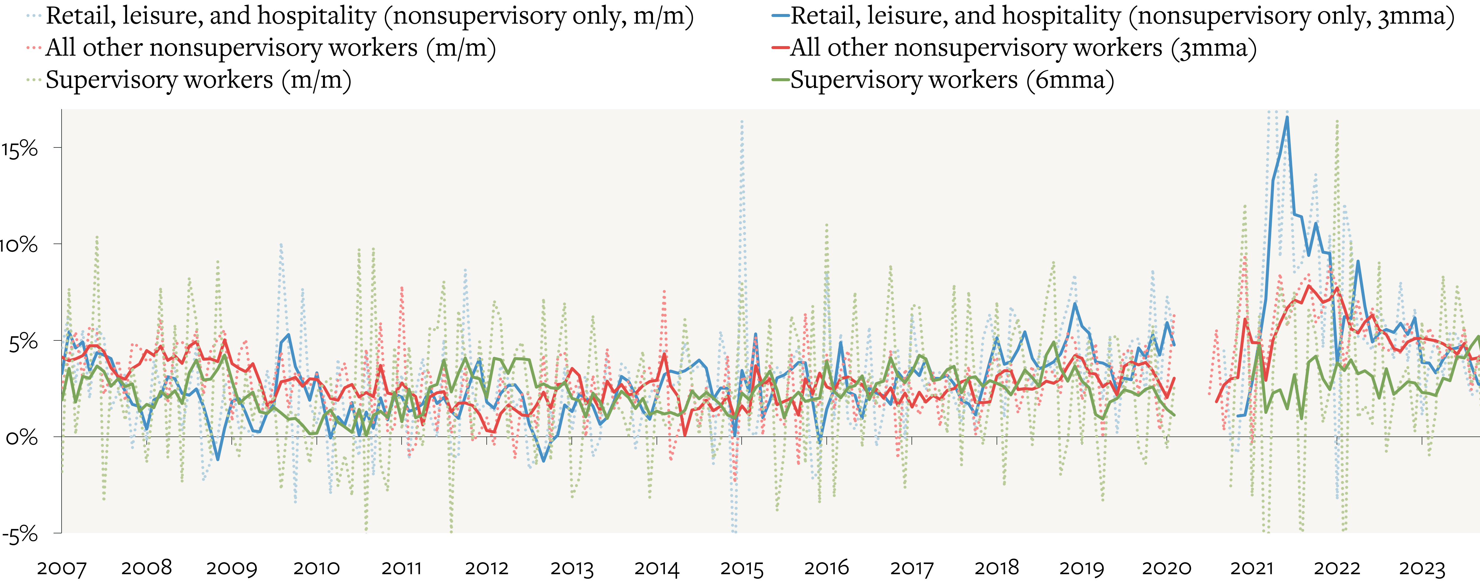
The solution is simple: cut down the number of series, and label each one on the chart itself.
4. The map is not the territory
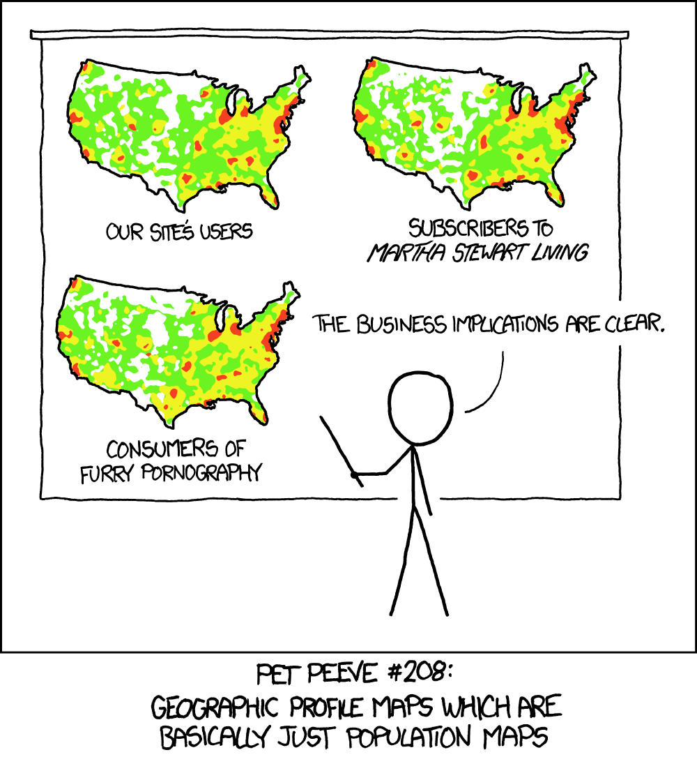
Maps are often (usually?) more misleading than helpful. Take this very, very bad graphic from the usually very, very good Bloomberg graphics team. It exemplifies three specific bad chart practices.
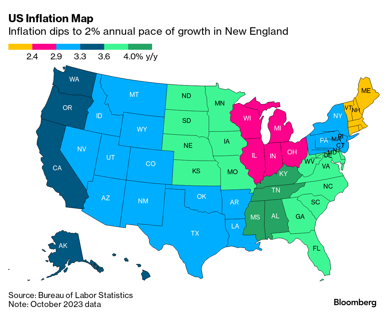
First, the categories are colored ludicrously. Each category here is a degree of the same thing (inflation), they should be varying shades of the same color.
Second, the reader is forced to jot back and forth between the map and the legend to match the degree of inflation to the state (this is the issue I raised in point 3 above, about labelling and legends).
And there is an additional problem here.
The map is attached to a story about how inflation is higher in poorer states. But the map isn’t showing us the relationship between inflation and state poverty, it’s showing us the spatial location of inflation. Is there something inherently less inflationary about being on the coast (favorable trade winds?).
There is also a problem with maps as data visualization tools in general: they overemphasize large regions rather than populous ones. As Edward Tufte writes of county-based maps:
Maps “wrongly equate the visual importance of each county with its geographic area rather than with the number of people living in the county.”
This is especially problematic because the bias that American state and county maps introduce—towards large administrative regions—is not random.
The geographic size of American states/counties correlate with a number of other variables: population density and education, for example. Unsurprisingly, since highly-educated liberals evince a preference for density, we got a 2016 electoral map that looked like this:
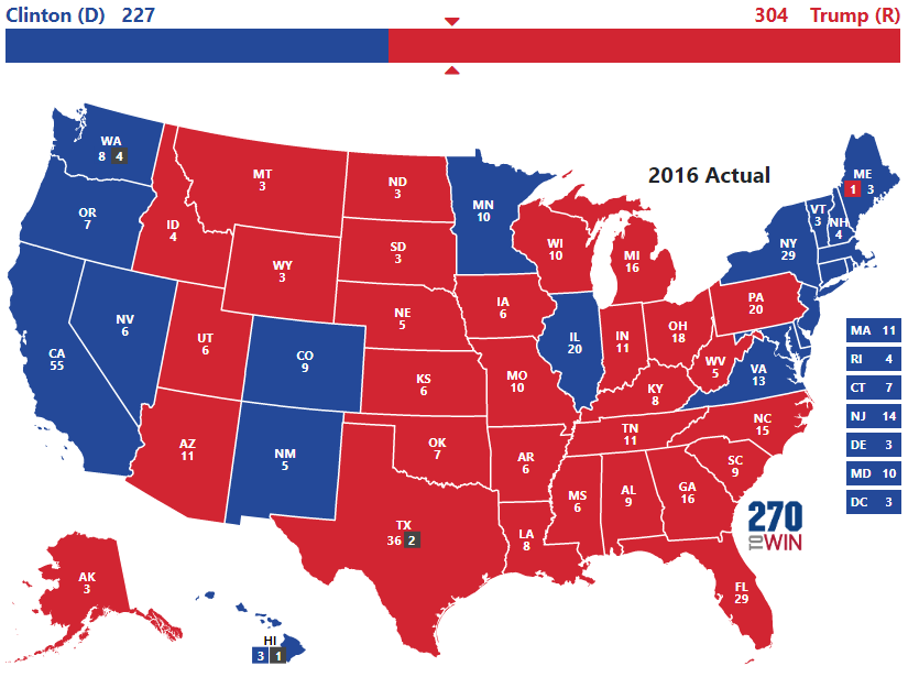
Contrast the map with a bar sitting right above it. The map vastly inflates the appearance of a Trump landslide compared to the (more accurate) bar.
And before Republicans living in Montana yell at me, I’ll point out that the bias cuts both ways: maps purporting to show the spatial location of some variable often merely highlight densely-populated—and typically more progressive—regions.
The bottom line is that maps link a variable (inflation, voting pattern, etc) with geographic size or density, and this is almost never the relationship that you’re trying to show.
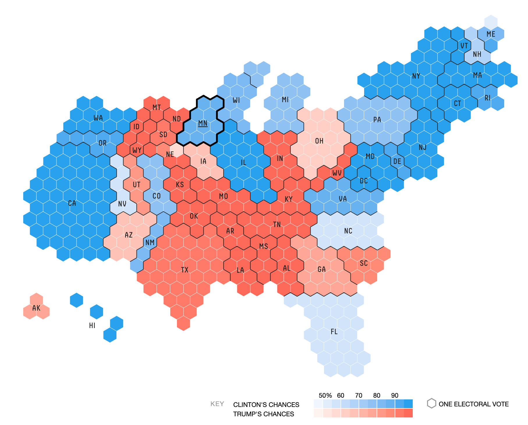
There are solutions to this problem. Hex maps, for example, allocate map space proportionally with population (this map from fivethirtyeight shows electoral college votes). But hex maps look undeniably weird, and only vaguely resemble the country’s actual geography.
5. Format your charts for mobile and desktop
These days, around half of your readers are likely seeing your work on their phones (depending on your line of work and your audience). You should therefore format your charts in such a way that they are legible on tiny, thin-and-tall mobile screens as well as large and wide desktop screens.
Graphics on news websites like the NYT or WSJ are coded in various formats and are automatically served up in the right format for each medium. You can see this for yourself: open this article I wrote about the Fed for the WSJ. Resize your browser window—the chart will automatically reformat for the smaller space.
But most people making charts for internet consumption—including Substack newsletters—don’t have this capacity. You have to make one chart for all platforms. There is a tradeoff there. The chart format I use in my newsletter for example is legible on a phone, but looks slightly big on a desktop screen:
My recommendation is to use a square format (my charts are 300 x 300 pixels)—this makes your charts legible on mobile and only slightly larger-than-ideal on desktop (much better than them being illegible on mobile).
If you’d like help visualizing your data, simply reply to this email
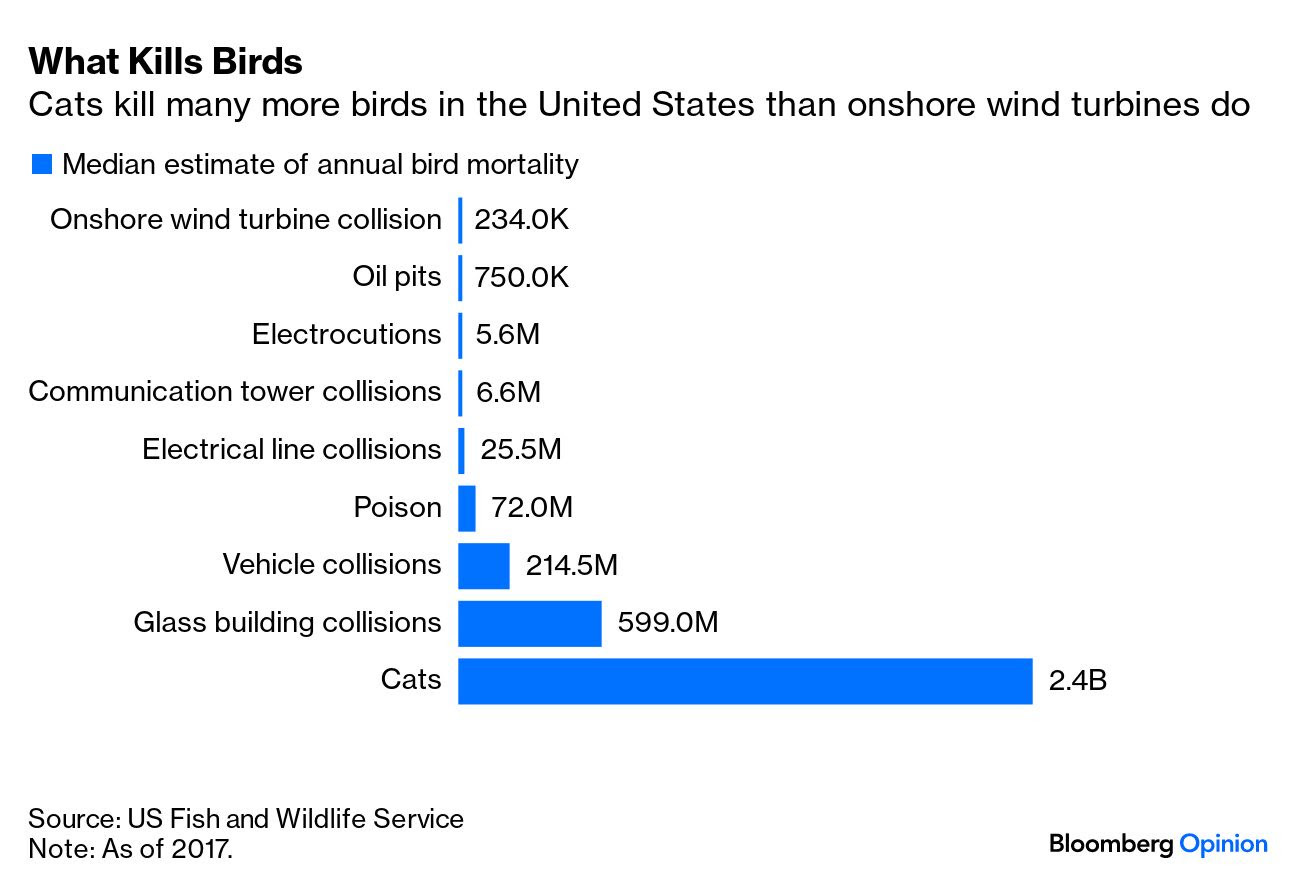
You should also test your fonts for small-screen legibility. The WSJ uses a proprietary custom font called Retina. Arial and Helvetica are good, widely-available options. Home Economics uses a mix of fonts, but is partial to Neue Haas Grotesk Display (basically, Helvetica). This is the same font Bloomberg News uses to get it crisp charts like this one:
Thanks for reading! If you’d like help visualizing your data, just hit reply to this email.
Really nice intro to chart art, and the pitfalls. Thanks!
Really enjoyed this one! Now do one on how to source the data for said charts