Welcome back to Home Economics, a newsletter about American housing.
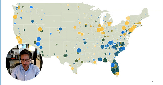
Something slightly different for this post: a video explanation of a map showing migration patterns across the United States (based on the Census Bureau's latest population estimates).
The map visualizes both domestic and international migration. The size of each bubble represents how much migration influences that area's population proportionally, while the colors tell us what kind of migration is happening: yellow for international, blue for domestic, and green for areas experiencing both.
What's fascinating is how clearly patterns emerge.
Coastal cities like New York and Los Angeles, along with college towns like Ithaca and Lafayette, shine yellow—they're magnets for international migrants but often lose residents domestically.
The blue bubbles concentrate in Arizona's retirement communities and throughout the Carolinas, where Americans are relocating for better weather and affordability.
Texas cities stand out in green, growing rapidly by attracting both international newcomers and domestic movers. Houston, in particular, shows surprisingly strong international migration alongside its domestic growth.
Florida tells the most interesting story, with bubbles covering the entire state in varying colors.
Miami draws international migrants while losing domestic population.
Retirement centers like Homosassa Springs fill with Americans from other states.
Areas like Cape Coral grow from both sources.
This diverse migration helps explain Florida's explosive growth.


Share this post